Cart + Horse
ROLE
Sole designer; concept through delivery
DELIVERABLES
Brand Identity System, Brand Guidelines (Visual + Voice), Social Asset Suite, Application Mockups (Web, App UI, Print), 3D Architectural Visualization Scenes
DATE
Summer 2024
Cart + Horse is a motion and design studio specializing in 3D product rendering, virtual production, and real-time interactive experiences. When their business began to take off, they needed a brand that looked the part.
Their existing identity was created by one of their motion designers out of necessity; playful enough to distract, bland enough to detract. The visuaI embodiment of a placeholder. The team are legitimate pros (I’m talking Triple A gaming studios and NBA team designers, pro).The brand wasn’t showing it.
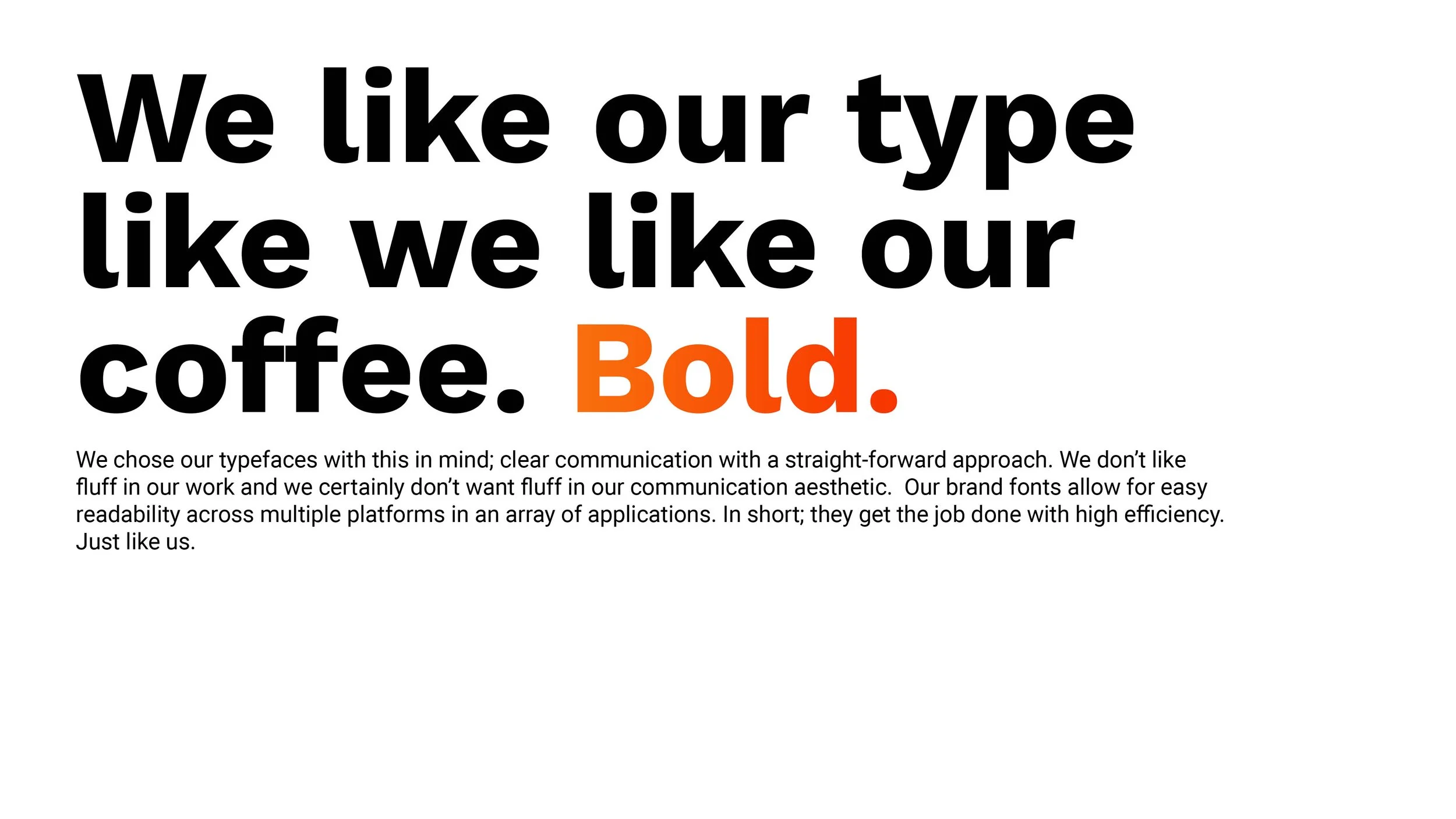
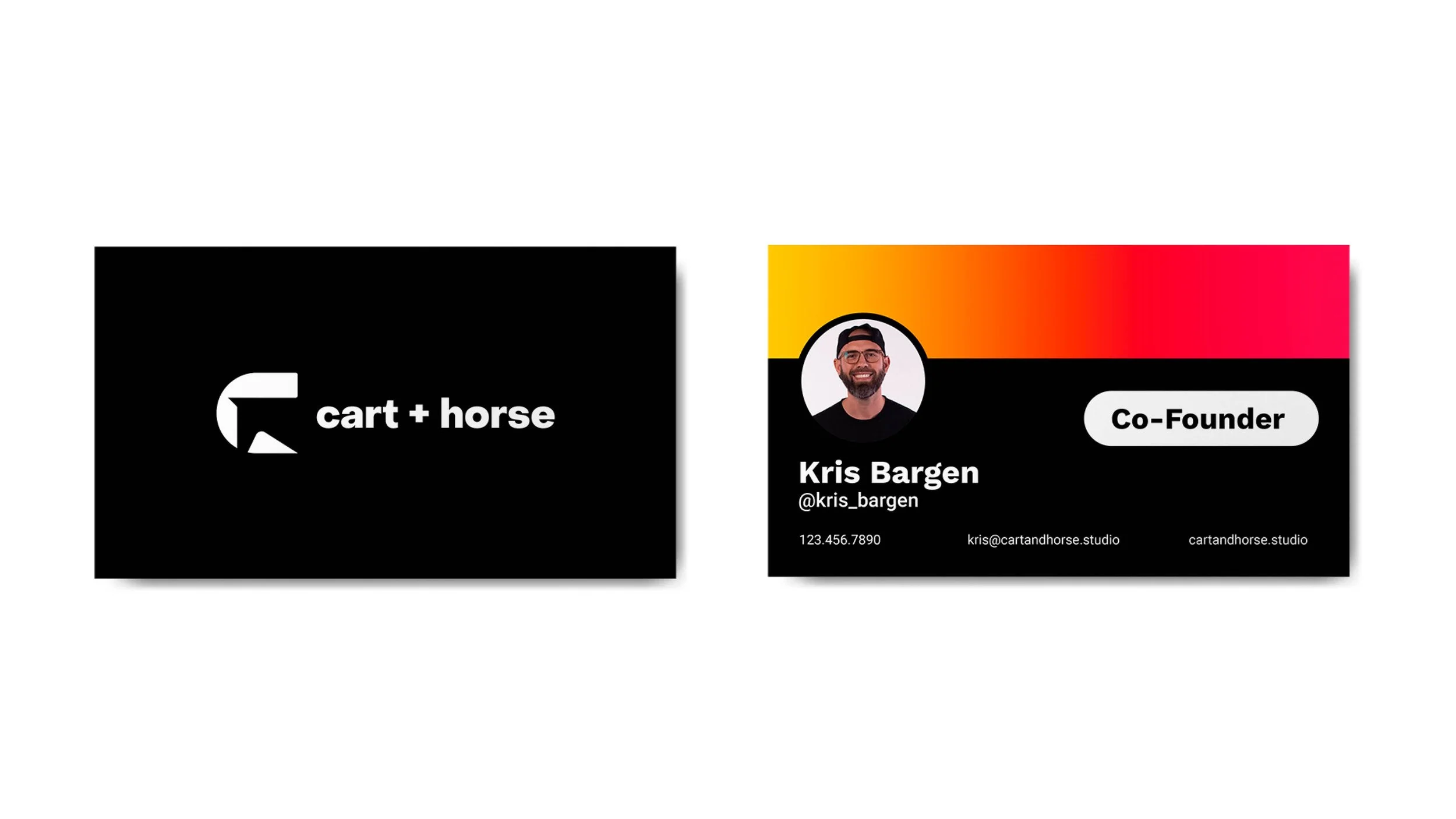
The new identity is built on the deliberate tension all designers feel: I need to be genuine enough to be approachable, but formal enough to be taken seriously. Bold logomark right next to a softer, lowercase logotype. Monochromatic palette with a funky gradient accent. Corporate typography letterforms paired with the occasional grammatical error. The contrast is the point. The level of their craftsmanship gave us the freedom to inject their personality into their brand expression. Simply put, when the render is that clean, you can drop a swear word every now and then.
Their team walked away with a full visual system and brand guidelines that showcased not only how the brand looks, but how it talks. The last bit is where most designers skip because it’s “not their department”. It’s also what made their brand usable after a handoff.
Brand Guidelines